
- Updated: January 18, 2026
- 7 min read
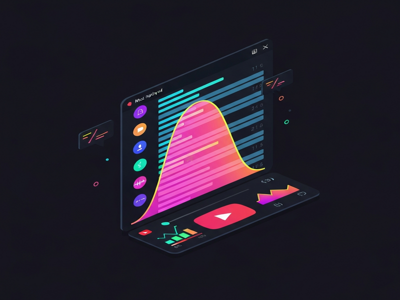
Understanding YouTube’s Most Replayed Heatmap – A Deep Dive
YouTube builds its “most replayed” heatmap by slicing a video into 100 equal segments, counting how many times each segment is viewed, normalizing the counts, and then drawing a smooth SVG curve with cubic Bézier splines. This process, which includes cold‑start handling and statistical sampling, can be reproduced with a few lines of JavaScript and a little math.
Why the Heatmap Matters to Tech‑Savvy Professionals
For data analysts, digital marketers, and developers building video‑centric products, the tiny graph that appears when you hover over YouTube’s progress bar is more than a visual curiosity. It reveals exactly which moments of a video compel viewers to rewind, a signal that can drive content strategy, ad placement, and even UI/UX decisions in custom video players.
In this article we dissect the original deep‑dive that reverse‑engineered the heatmap, then expand on the methodology with fresh examples, performance‑focused optimizations, and practical use‑cases for the UBOS platform overview. By the end you’ll be able to implement a fully‑featured replay‑analysis widget in minutes.
Key Takeaways from the Original Investigation
- The heatmap is generated client‑side from a JSON payload that contains
intensityScoreNormalizedvalues for 100 equal‑length segments. - Raw view counts are first normalized to a 0‑1 range to avoid overflow and to keep the graph within the player’s viewport.
- Cold‑start videos (new uploads) show no heatmap until enough data is collected, preventing division‑by‑zero errors.
- Sampling is used after a view‑count threshold (≈10 k views) to keep computation cheap while preserving shape.
- The SVG path is not a series of straight lines; it is a smooth curve built with cubic Bézier splines, which explains the characteristic “dips” beside the peak.
How YouTube Collects and Packages Replay Data
YouTube’s player continuously records the start and end timestamps of every watch session. Instead of logging each millisecond, it uses a difference‑array technique to keep write‑load low:
// Pseudo‑code
diff[startSegment]   += 1;
diff[endSegment + 1] -= 1;
When the server needs the heatmap, it runs a single prefix‑sum pass to reconstruct the frequency of each segment. This approach reduces billions of per‑segment writes to two atomic operations per user session.
Cold‑Start Handling
For a brand‑new video, the maximum segment count max_views is zero. The client therefore hides the heatmap until at least one segment has a non‑zero count, avoiding a divide‑by‑zero exception. This “cold‑start” phase typically lasts a few minutes for popular channels and a few hours for niche content.
Statistical Sampling
Once a video surpasses a configurable view threshold (the exact number is undocumented but observed around 10 k), YouTube switches to a sampled view‑stream. Instead of processing every replay, it randomly selects a representative subset of sessions, which dramatically cuts CPU and network overhead while preserving the overall shape of the heatmap.
From Raw Counts to a Polished SVG Curve
1️⃣ Normalization
After the prefix‑sum, the highest segment count maxViews is identified. Every segment’s count c_i is then scaled:
normalized_i = c_i / maxViews; // range 0‑1This guarantees the graph never exceeds the player’s height, regardless of whether the video has 1 k or 1 billion views.
2️⃣ Bézier Spline Smoothing
YouTube does not draw a polyline. Instead, it builds a cardinal spline using cubic Bézier commands (C) for each segment. The algorithm:
- Calculate a tangent vector between the previous and next points.
- Scale the tangent by a tension factor (≈0.2) to obtain two control points.
- Emit a
C x1 y1, x2 y2, x ycommand for the current segment.
The tension factor creates the subtle “dips” on either side of a sharp peak, preserving C¹ continuity (smooth first derivative) across knots.
SVG Path Construction (Simplified)
// points[] holds {x, y} after normalization
let d = `M ${points[0].x},${points[0].y}`;
for (let i = 1; i < points.length; i++) {
  const cp1 = getControl(points[i-1], points[i-2], points[i]);
  const cp2 = getControl(points[i], points[i-1], points[i+1], true);
  d += ` C ${cp1.x},${cp1.y} ${cp2.x},${cp2.y} ${points[i].x},${points[i].y}`;
}
svgPath.setAttribute('d', d);
The getControl helper mirrors the logic discovered in YouTube’s minified base.js and uses a 0.2 multiplier to keep the curve tight yet fluid.
Rendering the Heatmap with Tailwind‑Styled SVG
Below is a minimal, reusable Tailwind component that you can drop into any React, Vue, or plain‑JS project. It fetches the JSON payload from a mock endpoint, builds the Bézier path, and displays the heatmap under the video progress bar.
<div class="relative w-full h-2 bg-gray-200 rounded overflow-hidden">
  <svg class="absolute inset-0 w-full h-full">
    <path id="heatmap" class="stroke-blue-500 fill-none stroke-2"></path>
  </svg>
</div>

<script>
async function drawHeatmap(videoId) {
  const res = await fetch(`https://example.com/api/heatmap/${videoId}`);
  const data = await res.json(); // {segments: [{startMs, durationMs, intensityScoreNormalized}]}
  const points = data.segments.map((s, i) => ({
    x: (i / (data.segments.length-1)) * 1000, // width 1000px
    y: 100 - s.intensityScoreNormalized * 100   // invert Y‑axis
  }));
  const path = generateSplinePath(points);
  document.getElementById('heatmap').setAttribute('d', path);
}
drawHeatmap('abc123');
</script>
The component uses the same generateSplinePath function described earlier, ensuring the visual output matches YouTube’s native heatmap.
Practical Implications for Developers & Marketers
🔍 Content Optimization
By overlaying the heatmap on your own videos, you can pinpoint the exact timestamps that drive re‑watch behavior. Use this data to:
- Trim or reorder low‑engagement sections.
- Insert calls‑to‑action right after high‑replay moments.
- Generate chapter markers automatically.
📈 Advertising Placement
Advertisers can bid higher for slots that appear just before a peak, knowing viewers are likely to stay engaged. Integrating the heatmap into an AI marketing agents workflow automates this decision in real time.
⚙️ Custom Player Development
Open‑source video players (e.g., Web app editor on UBOS) can expose the heatmap as an interactive overlay, letting users scrub to the most‑replayed sections with a single click.
🤖 AI‑Driven Summarization
Pair the heatmap with OpenAI ChatGPT integration to auto‑generate summaries that focus on the most‑replayed moments, delivering concise recaps for long‑form content.
Explore More UBOS Solutions
If you’re looking to accelerate AI‑powered video analytics, UBOS offers a suite of ready‑made templates and services:
- AI YouTube Comment Analysis tool – sentiment mining for community feedback.
- AI SEO Analyzer – boost discoverability of your video pages.
- AI Article Copywriter – generate blog posts from replay highlights.
- AI Video Generator – create teaser clips automatically.
- AI LinkedIn Post Optimization – turn replay data into shareable social snippets.
Conclusion: Turn Heatmaps into Actionable Intelligence
YouTube’s “most replayed” heatmap is a compact, well‑engineered data product that balances accuracy, performance, and visual appeal. By understanding its pipeline—difference‑array aggregation, normalization, sampling, and Bézier spline rendering—you can replicate or extend the feature in any web‑based video platform.
Whether you’re building a custom player, enriching an AI‑driven marketing stack, or simply curious about the math behind the curve, the building blocks are now transparent. Start experimenting with the Tailwind component above, and let the insights guide your next content or product decision.
Ready to accelerate your AI projects? Visit the UBOS homepage for a free trial, explore the UBOS pricing plans, or join the UBOS partner program today.