
- Updated: November 26, 2025
- 7 min read
Understanding CSS Subgrid: An In‑Depth Guide
CSS Subgrid extends the native CSS Grid layout by allowing nested grid items to inherit the parent grid’s row and column tracks, which makes complex, responsive designs far easier to build and maintain.
Why CSS Subgrid Matters for Modern Web Design
Since its first implementation in Firefox 2019 and later in Chrome 2021, CSS Subgrid has become a game‑changer for developers who need consistent alignment across deeply nested components. If you’re a front‑end developer looking to sharpen your responsive layout skills, understanding Subgrid unlocks patterns that were previously only possible with tables or heavy JavaScript hacks.
In this guide we’ll explore the fundamentals, showcase real‑world layout possibilities, warn about common pitfalls, and provide fallback strategies for older browsers. Along the way we’ll also highlight how the UBOS platform overview can accelerate your Subgrid experiments with ready‑made components and a visual Web app editor on UBOS.
1️⃣ Introduction to CSS Subgrid
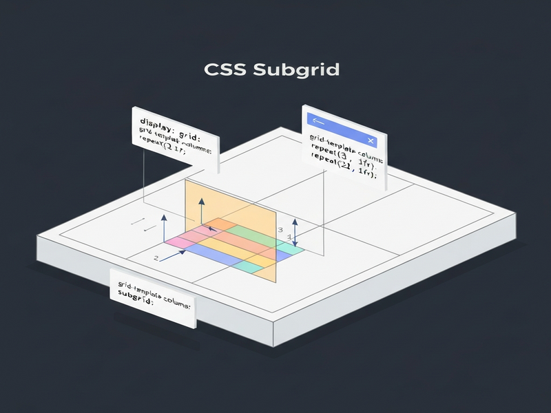
The original CSS Grid specification limited grid participation to an element’s direct children. This meant that any semantic wrapper—like <ul>, <section>, or <article>—could not share the parent’s column or row definitions, forcing developers to either flatten the markup or resort to Flexbox for inner layers.
Subgrid solves this by letting a child grid grid-template-columns: subgrid and/or grid-template-rows: subgrid. The child then inherits the exact track sizes from its ancestor, while still being able to define its own gap or align‑items values.
For a quick visual, think of a parent grid as a spreadsheet and Subgrid as a set of cells that you can “zoom in” on without losing the original column widths. This is especially powerful for UBOS templates for quick start, where you often need a reusable card component that aligns perfectly with surrounding content.
2️⃣ Benefits and New Layout Possibilities
Using Subgrid unlocks several practical advantages:
- Semantic markup without layout loss – Keep your HTML meaningful (e.g.,
<ul>for lists) while still participating in the grid. - Consistent alignment across components – Sibling elements inside different nesting levels line up on the same baseline.
- Reduced CSS complexity – Fewer media queries and manual width calculations.
- Better maintainability – Layout changes propagate automatically through the grid hierarchy.
Real‑World Example: A Portfolio Grid
Imagine a portfolio page where each project is wrapped in a <section> that contains a heading, an image, and a description. With Subgrid, the heading and image can share the same column widths as the surrounding navigation bar, ensuring perfect vertical rhythm.
.gallery {
  display: grid;
  grid-template-columns: 1fr 2fr 1fr;
}
.project {
  grid-column: 1 / -1;               /* span full width */
  display: grid;
  grid-template-columns: subgrid;    /* inherit 3 columns */
}
.project img { grid-column: 2; }      /* image sits in middle column */
.project h3  { grid-column: 1 / -1; } /* title spans all columns */
The result is a clean, responsive layout that automatically adapts when you add or remove projects—no extra CSS needed. You can prototype this instantly in the Workflow automation studio, then export the code to your project.
Dynamic Content with Subgrid
Subgrid also shines when dealing with dynamic data, such as a list of AI SEO Analyzer results. Each result row can inherit the same column widths as the header, guaranteeing perfect column alignment even when the number of rows changes at runtime.
3️⃣ Common Pitfalls and Gotchas
While Subgrid is powerful, it has quirks that can trip up even seasoned developers.
3.1 Reserving Space for Subgrid Rows
By default a subgrid occupies a single track. If you need it to span multiple rows, you must explicitly reserve those rows on the parent. Forgetting to do so collapses all children into one line.
/* Parent grid */
.container {
  display: grid;
  grid-template-rows: repeat(6, auto);
}

/* Child that will become a subgrid */
.sub {
  grid-row: span 6;               /* reserve 6 rows */
  display: grid;
  grid-template-rows: subgrid;    /* inherit rows */
}
3.2 Line Number Reset
Subgrid inherits track sizes but re‑indexes line numbers. A child’s grid-column: 2 refers to the second line of its own subgrid, not the parent’s original line. To avoid confusion, use grid-area names instead of numeric lines when possible.
3.3 Incompatibility with Fluid Grids
Fluid patterns like repeat(auto-fill, minmax(100px, 1fr)) don’t mix well with Subgrid because the parent’s track count is dynamic. If you need a fluid layout, consider using a fixed column count for the subgrid portion or fallback to Flexbox for that section.
3.4 Browser Support Gaps
Subgrid is supported in Firefox, Chrome, and Safari as of early 2024, but older versions and some mobile browsers still lack it. Use a feature query to provide a graceful fallback:
@supports (grid-template-columns: subgrid) {
  .card { display: grid; grid-template-columns: subgrid; }
}
@supports not (grid-template-columns: subgrid) {
  .card { display: block; /* simple stacked fallback */ }
}
The Enterprise AI platform by UBOS includes a built‑in polyfill that automatically switches to a Flexbox‑based layout when Subgrid isn’t available, saving you from writing duplicate CSS.
4️⃣ Nested Grid Techniques
When you combine Subgrid with traditional nested grids, you can achieve sophisticated UI patterns with minimal code.
4.1 Two‑Level Subgrid for Card Layouts
A common pattern is a parent grid that defines the overall page columns, a child grid that defines rows for a card, and a sub‑subgrid that aligns inner elements (image, title, actions). This hierarchy keeps each component isolated while preserving global alignment.
/* Page level */
.page {
  display: grid;
  grid-template-columns: 1fr 3fr;
}

/* Card container */
.card {
  grid-column: 2;
  display: grid;
  grid-template-rows: subgrid;
}

/* Inside the card */
.card-content {
  display: grid;
  grid-template-columns: subgrid;
}
The AI Article Copywriter template on UBOS demonstrates this technique, allowing the headline, image, and CTA button to stay perfectly aligned with the surrounding sidebar.
4.2 Using Named Grid Areas Across Subgrids
Named areas survive the subgrid boundary, making them ideal for complex dashboards. Define areas on the root grid, then reference them in any nested subgrid.
.dashboard {
  display: grid;
  grid-template-areas:
    "nav header"
    "nav main"
    "footer footer";
}

/* Subgrid inside main */
.main {
  grid-area: main;
  display: grid;
  grid-template-areas: "stats chart";
}
This approach is used in the AI Video Generator UI, where the stats panel and video preview stay aligned regardless of screen size.
5️⃣ Browser Compatibility and Fallbacks
According to Can I use…, Subgrid enjoys ~85 % global coverage as of November 2025. The remaining gap is mostly older Android browsers and legacy Edge.
5.1 Feature Queries
Wrap Subgrid‑specific rules in @supports blocks, as shown earlier. This ensures modern browsers get the full benefit while older ones receive a functional fallback.
5.2 Progressive Enhancement with UBOS
The UBOS partner program offers a ready‑made subgrid‑fallback.js library that detects missing support and injects a lightweight Flexbox shim. Integrating it is as simple as:
<script src="https://cdn.ubos.tech/subgrid-fallback.js"></script>
5.3 Testing Tools
All major devtools now include a “grid overlay” that visualises Subgrid tracks. In Chrome DevTools, open the Elements panel, select a grid container, and click the grid icon to toggle the overlay. Firefox’s grid inspector was the first to support Subgrid visualisation, making it a valuable debugging aid.
6️⃣ Conclusion & Further Resources
CSS Subgrid bridges the gap between semantic HTML and pixel‑perfect design, giving developers a native, CSS‑only way to align nested components. By mastering Subgrid you can reduce reliance on JavaScript layout hacks, improve accessibility, and create more maintainable codebases.
Ready to experiment? Start with the UBOS templates for quick start, pick a layout like the AI YouTube Comment Analysis tool, and adapt it using Subgrid. When you need a backend AI service, the OpenAI ChatGPT integration or the Chroma DB integration can power dynamic content.
For a deeper dive, check out the original announcement on MDN Web Docs. This external link provides the official specification and browser compatibility tables.
Stay ahead of the curve—integrate Subgrid today and let your web design breathe with the same flexibility as your data.