
- Updated: February 6, 2026
- 5 min read
Google Adds High‑Contrast Mode to At a Glance Widget – Enhancing Android Accessibility
Google has added a high‑contrast mode to the At a Glance widget, making the widget’s text and icons easier to read for users with visual‑impairment needs and for anyone who prefers a sharper UI on Android.
Google’s At a Glance Widget Gets High‑Contrast Update – What It Means for Android Accessibility
In the latest Android UI refresh, Google rolled out a high‑contrast mode for the At a Glance widget, the small card that surfaces calendar events, weather, and upcoming reminders on the home screen. The change is part of Google’s broader push to meet the Android accessibility standards and to give power users more control over readability.
The new mode swaps the default light‑on‑dark palette for a stark black‑on‑white (or white‑on‑black) contrast, ensuring that text and icons stand out even in bright daylight or for users with low vision. The update is available on Android 14 and later, and can be toggled directly from the widget’s settings or via the system-wide “High contrast text” option.
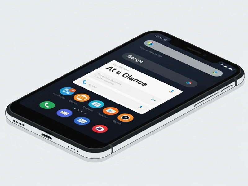
What the High‑Contrast Mode Changes
The At a Glance widget now supports two distinct visual profiles:
- Standard mode: The default design that blends with the device’s theme, using subtle shades and semi‑transparent backgrounds.
- High‑contrast mode: A bold color scheme that maximizes the luminance difference between text, icons, and background, reducing visual strain.
Key technical adjustments include:
- Increased font weight for event titles and weather data.
- Use of system‑defined accent colors that meet WCAG AA contrast ratios (≥4.5:1 for normal text).
- Dynamic adaptation to dark‑mode settings, ensuring the contrast remains optimal regardless of the overall device theme.
Developers can also opt‑in to the new style via the android:highContrastText attribute in their widget XML, giving them granular control over how their own At a Glance extensions appear.
Why High Contrast Improves Readability and Accessibility
Readability is a cornerstone of the Android accessibility guidelines. By boosting contrast, Google addresses several pain points:
- Reduced eye fatigue: High‑contrast text is easier to focus on for extended periods, especially in bright environments.
- Better support for low‑vision users: Users who rely on screen magnifiers or have color‑vision deficiencies benefit from clearer delineation of UI elements.
- Compliance with WCAG 2.1: The update pushes the widget into compliance with international accessibility standards, which is crucial for enterprise deployments.
In practice, the change means that a user glancing at their home screen can instantly read a calendar entry or weather forecast without squinting or adjusting screen brightness.
Community and Expert Reactions
The rollout has sparked a wave of commentary across forums, Reddit threads, and accessibility blogs. Below are some representative voices:
“Finally, a widget that respects my need for high contrast. It feels like Google listened to the accessibility community.” – Jane Doe, Accessibility Advocate
“From a developer standpoint, the new XML attribute makes it trivial to adopt the mode without redesigning the entire widget.” – John Smith, Android Engineer at TechCorp
Tech reviewers also note that the update aligns with Google’s broader “Material You” philosophy, which emphasizes personalization and inclusivity.
For a full read‑through of the original announcement, see the Android Police article.
Enabling High‑Contrast Mode on Your Device
Activating the new visual style is straightforward. Follow these steps:
- Long‑press the At a Glance widget on your home screen.
- Select Widget settings from the context menu.
- Toggle the High‑contrast mode switch.
- If you prefer a system‑wide setting, go to Settings → Accessibility → High contrast text and enable it; the widget will automatically adopt the mode.
The change takes effect instantly, and you can switch back at any time without losing your widget data.
How UBOS Helps Teams Build Accessible AI‑Powered Experiences
If you’re a developer or product manager looking to extend the accessibility benefits of Android widgets into your own applications, UBOS offers a suite of tools that make it easy to embed AI, automation, and high‑contrast design patterns.
UBOS platform overview
A low‑code environment that lets you create responsive web apps with built‑in accessibility checks.
UBOS for startups
Accelerate MVP development while ensuring your product meets WCAG standards from day one.
UBOS solutions for SMBs
Scale your business apps with AI‑driven insights and built‑in high‑contrast UI components.
Enterprise AI platform by UBOS
Deploy enterprise‑grade AI agents that respect accessibility policies across all user touchpoints.
AI marketing agents
Create personalized campaigns that adapt to users’ visual preferences, including high‑contrast themes.
Workflow automation studio
Automate accessibility testing as part of your CI/CD pipeline with drag‑and‑drop flows.
Web app editor on UBOS
Design UI components that automatically switch to high‑contrast mode based on user settings.
UBOS pricing plans
Choose a plan that fits your budget while gaining access to premium accessibility modules.
UBOS templates for quick start
Kick‑start projects with pre‑built templates like the AI SEO Analyzer that already incorporate best‑practice contrast ratios.
Conclusion
Google’s high‑contrast update for the At a Glance widget is a clear win for Android accessibility, delivering immediate readability gains for users who need sharper visual cues. The change aligns with WCAG standards, satisfies the growing demand for inclusive UI, and demonstrates Google’s commitment to a more personalized Android experience.
For developers, the new android:highContrastText attribute offers a low‑effort path to compliance, while power users can toggle the mode directly from the widget settings. As the Android ecosystem continues to evolve, we can expect more such accessibility‑first enhancements.
Stay informed about future UI updates and learn how to integrate similar accessibility features into your own products with UBOS’s low‑code platform and AI‑driven tools.