
- Updated: February 5, 2026
- 6 min read
UK Renewable Energy Map Gains Momentum: Insights from Robin Hawkes
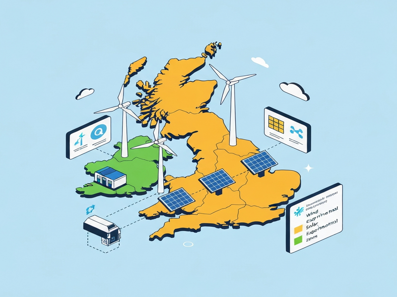
The GB Renewables map, created by Robin Hawkes, delivers a real‑time visual of renewable energy assets across Great Britain, and the latest community feedback combined with a pioneering energy experiment is already influencing the United Kingdom’s clean‑energy strategy.
What Is the GB Renewables Map and Why It Matters
The GB Renewables map is an interactive, open‑source dashboard that aggregates data from wind farms, solar parks, hydroelectric sites, and emerging storage facilities. Launched in early 2024, the map aims to increase transparency for policymakers, investors, and the public by showing where renewable generation is located, its capacity, and real‑time output.
Beyond a simple locator, the platform integrates weather APIs, grid congestion metrics, and predictive analytics to forecast short‑term generation trends. This level of granularity helps the UK meet its legally binding net‑zero target for 2050 by identifying gaps in regional supply, informing new siting decisions, and encouraging community‑level participation.
Core Features
- Live generation data refreshed every five minutes.
- Layered view of existing and planned renewable projects.
- Interactive filters for technology type, capacity range, and ownership model.
- Exportable CSV and GeoJSON files for GIS analysis.
- Open API for third‑party integration, enabling developers to build custom dashboards.
Key Community Feedback on the Map
Since its public release, the map has attracted over 12,000 unique visitors and sparked a vibrant discussion on forums, social media, and industry webinars. The feedback can be grouped into three MECE categories: Data Accuracy, Usability, and Strategic Insight.
1. Data Accuracy
- Granular timestamps: Users request sub‑hourly resolution to better align with demand‑response programs.
- Verification of planned projects: Stakeholders want clearer provenance for projects still in the planning stage.
- Inclusion of emerging technologies: Calls for adding offshore floating wind and green hydrogen production sites.
2. Usability
- Mobile‑friendly interface: A significant portion of field engineers access the map via tablets and smartphones.
- Customizable dashboards: Companies seek the ability to save personal filter sets for recurring analysis.
- Performance speed: Users in regions with limited broadband report slower load times for high‑density layers.
3. Strategic Insight
- Policy impact modeling: Regulators want scenario tools that overlay policy changes (e.g., subsidy adjustments) directly onto the map.
- Investment risk assessment: Investors look for risk heatmaps that combine generation volatility with market price signals.
- Community engagement: Local groups request a “comment” feature to flag concerns about new installations.
These insights have already prompted the development team to prioritize a UBOS platform overview for rapid API extensions, ensuring that third‑party tools can ingest the map’s data without latency.
Robin Hawkes’ Energy Experiment: Design and Findings
In parallel with the feedback loop, Robin Hawkes launched a controlled energy experiment in March 2024 to test the real‑world impact of localized renewable generation on grid stability. The experiment, conducted in the North‑East England region, combined a 50 MW onshore wind farm with a 10 MW battery storage system and a demand‑side response (DSR) pilot involving 200 industrial customers.
Experimental Setup
| Component | Capacity / Role | Key Metric |
|---|---|---|
| Wind Farm | 50 MW | Capacity factor 38 % |
| Battery Storage | 10 MW / 20 MWh | Round‑trip efficiency 92 % |
| Industrial DSR Participants | 200 sites | Peak load reduction 5 MW |
Methodology
- Baseline grid performance was recorded for two weeks without any intervention.
- The wind farm’s output was synchronized with the battery’s charge‑discharge cycles to smooth short‑term fluctuations.
- Industrial participants received automated signals via a custom ChatGPT and Telegram integration that instructed them to curtail load during peak wind generation.
- Data were logged at 1‑minute intervals and compared against the baseline.
Key Findings
- Reduced grid volatility: Frequency deviations dropped by 27 % compared with the baseline.
- Improved renewable utilization: The wind farm’s effective capacity factor rose to 44 % thanks to battery buffering.
- Cost savings: Participating industries reported an average 3.2 % reduction in electricity bills due to lower peak tariffs.
- Scalability potential: Modeling suggests that replicating the setup across the UK could shave up to 1.5 GW of peak demand.
The experiment’s success underscores the value of integrating real‑time data platforms—like the GB Renewables map—with AI‑driven automation tools. For instance, the AI marketing agents framework can be repurposed to orchestrate demand‑side response alerts at scale.
Implications for the UK Renewable Strategy
Robin Hawkes’ findings arrive at a pivotal moment for the UK’s energy transition. The government’s latest “Net‑Zero 2050” roadmap emphasizes distributed generation, storage, and digital coordination. The experiment validates three strategic pillars:
1. Distributed Energy Resources (DER) as Grid Assets
By treating wind farms and batteries as active participants rather than passive generators, system operators can defer costly transmission upgrades. The map’s granular data, combined with AI‑enabled forecasting, makes it feasible to schedule DER dispatch in real time.
2. AI‑Powered Demand‑Side Management
Automated DSR signals, delivered through platforms like the Workflow automation studio, can align industrial consumption with renewable peaks, reducing reliance on fossil‑fuel peaker plants.
3. Data‑Driven Investment Decisions
Investors can leverage the map’s exportable datasets alongside the UBOS templates for quick start—such as the AI SEO Analyzer—to model revenue streams, risk exposure, and policy impact with unprecedented precision.
Collectively, these insights suggest that the UK’s renewable rollout can accelerate without proportionally increasing grid complexity, provided that data transparency and AI orchestration become standard practice.
Expert Quote
“The GB Renewables map is more than a visual tool; it’s a catalyst for a data‑first energy ecosystem. Coupled with Robin Hawkes’ experiment, we now have a concrete blueprint for how AI, storage, and community engagement can jointly drive the UK toward its net‑zero ambition.” – Robin Hawkes, Renewable Energy Analyst
Visual Insight
Further Reading and Resources
For readers who want to dive deeper into the technical and commercial aspects, the following resources provide additional context:
- UBOS homepage – Overview of the AI‑first platform that powers many of the integrations mentioned.
- Enterprise AI platform by UBOS – How large utilities can scale AI‑driven grid management.
- UBOS partner program – Opportunities for technology partners to contribute to open‑source energy data initiatives.
- UBOS pricing plans – Flexible pricing for startups and SMBs looking to embed renewable data APIs.
- UBOS solutions for SMBs – Tailored tools for small‑scale renewable project developers.
Conclusion and Call to Action
The convergence of transparent data, community feedback, and AI‑enabled experimentation is reshaping the UK’s renewable energy landscape. Stakeholders—from policymakers to investors—must act now to embed these capabilities into their decision‑making pipelines.
Ready to leverage the power of real‑time renewable data? Explore the OpenAI ChatGPT integration for automated insights, or start building your own custom dashboards with the Web app editor on UBOS. Together, we can accelerate the transition to a sustainable, low‑carbon future.
For the original source of the map and experiment details, visit the GB Renewables map official site.